
Sunday 6 March 2011
Possible fonts for album cover and magazine advert
Back Cover

This is the back cover of the album, again i decided to use red in order to tie in with the whole colour scheme. I decided to keep the back simple and readable as it has the songs which feature on the album. I used images of the shoes which feature in the video of 'fashion' as this is the bands debut song it will be easily recognised and noticable.
Front Cover
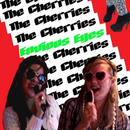
This is the front cover of my album. Using the feedback i recieved i decided to use these two images at the front of the album. I also chose to repeat the bands name in the background and also featured the album name in the middle. I thought by using the green for 'Envious Eyes' will help tie in with the name of the album. I decided to use a red background to tie in with the bands name and kept the name simple with black and white in order for it not to be over the top.
Inside left

This is the inside left of my album. I decided to make it stand out with colours and the repetition of the bands website in order to catch the eye and make it stand out.
Inside Right

This is the inside right of my album which will be the image on the CD. I think its fun and the cherries emphasises the band name.
Possible images for Album cover and Magazine advert
These are the possible images that I might use on my album cover and magaz, I have used photoshop to add effects to the images and make them look more professional.


Possible magazine advert
1)
2)

3)

These are the 3 possible magazine adverts i have created. I decided to use red on all of them as it ties in with the band name and also its the colour scheme for the album. Also i have used the same images as i did on the album in order for it to be recognised more easily and noticed.
Final magazine advert

I have chosen this as my final magazine advert. I decided to use the same images and font as my album cover as this will help consumers understand and notice the group easily. Also i have used the album on the magazine advert as while i have been researching magazine adverts most of them use an image of the album. Using the album image also helps consumers to recognis the album when in stores.
Wednesday 2 March 2011
Album cover analysis- Pink

Tuesday 1 March 2011
Feed back on band name
After thinking of a name with my group for what we should call this group and what the album should be called i decided to ask classmates for their feedback on what they thought was more suitable for the song.
I asked them 3 questions
1) which name do you prefer for the girl band?
Fashion Fix, Cherry.Couture, CLF (cherries love fashion) or The Cherries
After asking 30 people the results were that 16 people liked 'The Cherries' as it was simple and easy to remeber. 1 person said CLF, whilst 8 people liked Cherry.Couture and the remaining 5 liked Fashion Fix.
I decided to go along with the results and decided that 'The Cherries' was the most suitable name for this genre of music and the song.
I then decided to ask them which of the fonts suited the name more
A)
B)

C)
D)

I found that most people liked C and therefore i decided to use this as my font. I found all the fonts from UrbanFonts.com
I then asked my 3rd and final question which was on the name of the album.
3) Which one of these album titles do you prefer for 'The Cherries' debut album?
Fashion Galore, Envious Eyes, Pop Control
I asked the same 30 people and 23 people chose envious eyes as it features in the song whilst a mere 3 chose Fashion Galore and the remaining 4 chose Pop Control
Photoshop
Photoshop is the programme I will be using in order to edit and create my album covers, inlays and magazine adverts.
The programme has many advantages to it one being that there are many effects you can use in order to create the image you want also it is a fairly easy programme to use. I can easily add text to images or change the colour scheme on them or even take out any background I do not need or want. Also as I need to create a digi-pack using the programme to do this will be easy and quick as I can easily create my final product into it.
If I find myself to become stuck there are many tutorials on Youtube.com that explain what I can do and also there are many different effect techniques also.

Final Cut Express
Final Cut Express is the programme I will be using to edit my video using an Apple Mac computer.
The programme has many benefits, the main one being it is easy to use and understand. It is easy to add effects to the video clips and edit out any unnecessary parts I don’t need. I plan on using many different effects and techniques in order to enhance the quality of my video. I also want to make the video exciting by adding colour or distorting clips. As the song by Rouge Traders is very upbeat and has a fast tempo I plan on cutting the videos to make them change fast and quick in order to go with the beat and music.
As Final Cut Express has many layers when editing material, it is easy to create different effects with the layers and also you can play it with the song to see if it works.
The programme allows us to import pieces of material that we need in order to create the video. Also by being able to export the final version of the video we are easily able to upload it to the blog and other internet sites such as Youtube for feedback.

Independant Record Labels
An independent record label (or indie record label) is a record label operating without the funding of or outside the organizations of the major record labels. A great number of bands and musical acts begin on independent labels. The boundaries between major and independent labels, and the definitions of each, differ from commentator to commentator. The traditional definition of a 'major' record label is one that owns its own distribution channel. Some independent record labels, in particular those with successful performing artists, sign dual-release agreements (and make other deals) with major labels and may rely to some extent on international licensing deals, distribution agreements, and other arrangements with major record labels. Major labels may also wholly or partially acquire independent labels.


Record Companies
Record labels may be small and independent, or they may be part of a large international media group. The largest four record labels are called ‘Major Labels.’ Since 1988-2009 there has been a change in these major labels. It first began with the ‘Big Six’ consisting of record labels such as Warner Music Group, EMI, Sony Music, BMG Music, Universal Music Group and Polygram. Over the years this has decreased to just 4 labels now being called the ‘Big four.’ Till today the big four record label groups are Universal Music Group, Sony Music Entertainment, EMI Group and Warner Music Group.

Universal Music Group (UMG) is the world’s largest group of record labels in the recording industry. It is the largest of the ‘Big Four’ record companies by its commanding market share and its multitude of global operations. UMG owns a music publisher named Universal Music Publishing Group, which became the world’s largest following the acquisition of BMG Music Publishing in May 2007. "Universal Music" was once the music company attached to film studio Universal Pictures. Its origins go back to the formation of the American branch of Decca Records in 1934. Artists signed to UMG include Akon, Justin Bieber, Kanye West, Robin Thicke, Lady Gaga, Lil wayne, Drake and many more.


Sony Music Entertainment abbreviated SME is the second largest global recorded music company of the ‘big four’ record companies and is controlled by Sony Corporation of America. The company which evolved into Sony Music was founded in 1929 as the American Record Corporation (ARC) through several smaller record companies. Sony renamed the record company Sony Music Entertainment (SME) on January 1991. Sony Music Entertainment throughout the years have signed many successful music artists. Some of these include Beyonce, Christina Aguilera, Bob Dylan, Kings of Leon, Leona Lewis and one of the most widely beloved entertainers the late Michael Jackson.


Album cover analysis - Rihanna
LOUD is the fifth studio album from Rihanna, we can see a dramtic change in image and in her music by just looking at 3 of her albums. Her first album ‘Music of the Sun’ uses the conventions of an album cover having used a simplistic colour scheme which also featured in her song "Pon de Replay." We get a close up shot of Rihanna gazing straight at us, from the album cover we do not know what is to come from the artist this is created by the imagery used as Rihanna poses with a ‘mysterious’ sort of face, this emphasises the fact that she is a new artist and we can never predict what will be to come, this indulges listeners as they are excited to hear what is next. Her name ‘Rihanna’ appears at the top left hand conrner of the album cover in a different colour scheme to the one used on the rest of the album, this is done in order for the image and the artists name to stand out and be more noticeable.

Rated R was the fourth album to come from the singer, looking at her first to the fourth there is an overwhelming and dramtic change to her image and possibly music. The album cover still has the conventions of an album but the colour scheme is dark and dull. Rihanna poses different as to that of her first album as here she is in a moody and contemplative pose, wearing a leather top with her hand covering her right eye and each finger wrapped in an intricate set of rings. The image was taken by fashion photographer Ellen von Unwerth who stated that "Rihanna was looking to create something a bit new for the look of the album.” Unlike all the other album covers ‘RATED R’ does not feature Rihanna’s name on the album cover, this could possibly due to the fact that the imagery of the album is so powerful anybody would easily notice her although the name of the album helps to understand who she is with the ‘R’. The strong image on the cover instantly gives away the sort of music which is to be expected in this album as at the same time there was the controversy of her abusive relationship with singer Chris Brown. The album shows another side to Rihanna that we have not encountered with yet, by using such forceful and strong imagery it instantly defines her and her work. As Rihanna would be soon touring the album helped create a ‘buzz’ of what was to be expected with the costumes, background visuals and performances.

Recently Rihanna has released LOUD her fifth album, yet again we have a change of appearance as now everything is red. Rihanna braced us with her red hair in her video of ‘Only Girl.’ Her red hair can be seen in the corners of the album and noticeably her lips are also red. Her lips are in the centre of the album cover, this may have been done in order to emphasise that Rihanna is now becoming a very successful aritst and she has the voice to speak out. The name of the album; ‘LOUD’ is also powerful as it could be said that she now has the opportunity and voice to write about things that matter to her, she does not need to create this image no more. The red in itself is loud as her prior album was black and white. Rihanna’s name does not appear on this album cover also, as now she is a well established artist who is known worldwide, it shows how powerful and successful she is.

Album cover analysis- Lady Gaga

This is the debut album by pop artist Lady Gaga called ‘The Fame.’ The album has a clear close up shot of the artist; Lady Gaga, this is done in order for consumers to understand that this is her album. In the image Gaga is wearing glasses to hide her eyes which people do in order for them to hide their identity. Gaga’s style is very unique and peculiar; the glasses she wears in the shot are also not normal everyday glasses as they have one eye covered. This gives a brief idea of what is to be expected from the album and also for future albums to come. She herself has hidden her identity and we can expect more of this in her future material. The name of the album is written in the corner of the glasses whilst ‘LADY GAGA’ is the main text on the image, the possible reason for this would be that as her face is mostly covered some consumers may not notice that this is her album, given the fact that it is her first also. The name is therefore emphasised in order for it to be more noticeable to the consumers. The use of also dark colours and blonde hair contrast and make the image stand out, as we know Lady Gaga takes her appearance to extreme levels although she has kept it simple for her first album.
Analysis of Cali Swag District - Teach Me How To Dougie
‘Teach me how to Dougie’ is the debut single from American hip hop group; Cali Swag District, the song was written by Corey Fowler, Chanti Glee and Cahron Child. It was directed by Yolande Geralds and was filmed in the group's hometown of Inglewood, California. The stereo typical view we have on music videos by hip hop artists is that they feature girls dancing in little clothing with men surrounding them. Also the video usually highlights the ‘finer things in life’ such as money, expensive cars, jewellery and big houses. Although this is not the case for the video ‘Teach me how to dougie’ instead the video has a vast amount of different age groups, ethnicities, sizes, body shapes, heights and colours. The song itself is a ‘feel good’ song where as soon as it is heard it is meant to be exciting and uplifting. The choice of using different people with different body shapes, ethnicities and some with disabilities has much kudos. The song is therefore open to everyone and anyone and does not single people out, as like many other hip-hop videos do. It also shows the multi-cultural society in which we live in today and the video picks up on this. For example at the end of the song we can see a Bhangra dance being performed, this is a form of dance that has originated in the Punjab region. Featuring the dance also opens restrictions of the song that some people may have, for example as the song is made by black African-Americans, certain ethnicities may believe that this sort of music is not suitable for them or their children to listen to but by having the vast amount of different people in the video it shows how open the song is and illustrates that it can be for anyone and anyone and not those who just enjoy typical hip-hop music. By looking at Cali Swag District other music videos and songs we have a clear understanding that they are not a typical hip-hop group and they want to be noticed for there individualism as well as for their different style of writing and creating music.

In the 11th second into the video we automatically see a relationship between the lyrics and the visuals. There is a build up into the song where we see children and then adults doing the ‘Dougie’ dance but as the 11th second reaches, the camera cuts to one of the members of the group named Smoove. We automatically understand he is a part of the group as he is filmed in another location from where the dancing is taking place, this therefore emphasizes his role and distinctively points out that he is a member of the group. He then sings “They be like Smoove (what?) Can u teach me how to dougie?” as he sings the line the camera cuts back and forth to those of different ethnicities and sizes dancing to the song. As the song continues we see more and more people dancing the ‘Dougie’ when there is another visual. Smoove then sings “And for you, you, you to back it up and dump it!” as he sings “you, you, you” the camera cuts to the whole group pointing then back to Smoove pointing directly to the camera and then to him pointing at a girl who is featured next to him throughout the whole video. Smoove’s next lyric is “Put your arms out front, lean side to side” as soon as the lyric starts the camera again cuts to a group of girls doing exactly what it says in the lyrics; they are putting out there arms and leaning side to side in a dance move. As Smoove finishes his verse the chorus begins and the whole group sing “Teach me how to dougie Teach me, teach me how to dougie” we get a good view of different people doing the ‘Dougie’ dance. This allows people to understand what the ‘Dougie’ dance is as the chorus is repeated 3 times and also the same dance move is being performed. We are then introduced to the second member of the group called ‘Yung’ we clearly understand who he is as we get a full shot of him away from the people dancing and he sings “My name is yung!” as he introduces himself in the same way Smoove has we begin to realise the repetition of the video and how the next member of the group will be introduced. They all stand alone and away from the crowd as this allows the audience to understand that they are the artists. As Yung sings his verse we get an individual visual from him as he sings “So I'm on my shoulders and I take it real low Dey like "how you da dat? he can dougie on the floor!" The camera cuts to Yung ‘Douging’ on the floor which is illustrated by the lyrics. As the song comes to an end verse 3 begins although the 3rd member of the group does not introduce himself in the same way Yung and Smoove have. The third member named Jayare begins his verse without telling us who he is although we understand he is a member of the group as his verse is filmed in the exact same way as Yung and Smoove’s. Jayare stands away from the crowd and has single shots of him singing the verse. Regardless of the introduction as to who he is, because of the repetition throughout the video the audience are expected to know that he is the 3rd member of the group.
The song ‘Teach Me How to Dougie’ is a very up-beat song and has a fast tempo to it. It features a metronomic and "cowbell-bolstered" beat. Pete Fraser says that the music video tends to make use of the tempo of the track to drive the editing. This is illustrated vigorously between the relationship of the music and the visuals. The video constantly cuts to the beat and has constant change. The visuals illustrate the lyrics as well as the dancing defines the up-beat tempo of the song. As the beat drops almost every time the camera changes to something new. The video also changes paces with the music as at the end when the beat is more consistent and heavy than the beginning of the song we see the pace of the dancing increase and this is also when the Bhangra dancing is introduced. As this is Cali Swags District first official music video and song the record company had to incorporate a way into the music video in order for the viewers to understand who was a part of the group and who the main people are in the video. As there are 3 verses in the song 3 out of the 4 members are shown in the music video, As each verse begins the member introduces themselves this is incorporated in the lyrics and we get a close up single shot of them away from the big dancing crowd. For the last verse which Jayare sings we are not told who he is or introduced to him, he is shot the same way as the other 2 members and therefore we as an audience have to think and understand for ourselves that he is also a member. I believe the director has chosen to do this as it would become tedious and boring to have the same introduction for all members of the group. By having Jayare not introduce himself this allows the viewers to wonder who this 3rd member might be and go on to research about the group to have more background knowledge. Without having to research them myself, I would have not known there is a 4th member of the group who is featured in the video although does not have an active part as the other members. Cali Swag District is a hip-hop group which was created in America, the image the band offer is far different from what other American hip-hop artists offer. The video in itself speaks out to the audience that they are not a typical hip-hop group who will go with the norm of a typical hip-hop video. The image they create for themselves is unique and this is also seen in their work. By being different they can attract more of an audience and people now days want to hear something different and also see something different. As this is the groups first video, it has a great impact as to what is to be expected of them as we already know they are not typical, what is to be expected cannot be predicted and this is what will attract more of an audience and fan base for them.
In reference to notion of looking the one of the members, Yung is topless in the video although he does not have a ‘perfect’ body image of being muscular and well built he is of a slim sort and has many tattoos. This also in itself emphasises the fact that the boys do not really care of their appearance and will not live up to what is expected of them. Other hip-hop artists such as 50 CENT and Lloyd Banks are all well built men in which it is evident they live up to what is expected of them as hip-hop artists and men. Yung is featured topless in the video in order to ‘spice’ up the video as such but in a very mild way, also it enables him to show his personality as he has many tattoos on his body. As we have not seen him before this allows us to create an image of what we expect him to be like in future record and videos. The group itself consists of young men aged from 20-22, this attracts a younger audience and as it is the groups first video there is no camerawork, dance or costume apart from Yung being topless which imply a sexualised display. The music video for this song has to be performance-based as the song is based on a dance. The song brought the ‘Dougie’ dance to the a huge success as did similarly by the New Boyz’ with their hit “You’re a Jerk” in 2010. Critics have said that the dance is a ‘branch-off’ movement of jerkin’. Although member Smoove disagrees with the statement and stated that the group itself and the dance have a more ‘street aspect’ and while the New Boyz’ feature in the music video they say they do not consider themselves associated with the jerkin dance.

Subscribe to:
Posts (Atom)

